
Italy posters: Tuscany, Venice and the Amalfi Coast on your walls
3 Italies share the walls: warm, calm Tuscany, turquoise and theatrical Venice, and the pop, sun-drenched Amalfi Coast. The guide to choosing which one (or all 3) to hang at home.

Key points
- 34 posters in the Italy posters collection, the 20 from this article in the table below.
- From 18,71 € in A4, up to 70,53 € in A0, 5 sizes for each poster.
- Printed in Spain on demand, free delivery from 59 €.
The table
The 20 posters at a glance

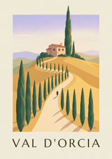


Italy is not a uniform country when you want to hang it on a wall. 3 graphic styles coexist: Tuscany with its ochre hills and cypress trees, Venice with its turquoise canals lined with pink and brick facades, and the Amalfi Coast with its cobalt-and-yellow lemons. Choosing one means choosing a mood for the room. Here’s how.
Tuscany calls for ochre and cypress-green palettes, ideal for a living room in warm tones or a dining room. Venice, with its turquoise waters and brick-pink facades, brightens an entryway or hallway, or becomes the single statement of a foyer. The Amalfi Coast and its lemons work in a sunny kitchen or a sunroom.
To take the experience further, see also our Italy posters or our Dolce Vita posters. Choose a brass-patina wood frame or a matte black metal frame to respect the original Art Deco spirit. Size A2 or A1 depending on the room. For the dolce vita spirit in the broader sense, see also our Italian and Dolce Vita decor guide.
3 Italies, 3 palettes, 3 moods
Italy shares a trait with France: a succession of regions that have almost nothing in common. Trying to sum up the country with a single poster means missing 90% of what it offers visually.
Tuscany speaks terracotta, olive green and pastel skies. Venice speaks turquoise, pink and brick, with black gondolas on the canal waters. Amalfi speaks lemon yellow, whitewash white and Mediterranean cobalt. 3 palettes that don’t blend naturally, and that each need a different kind of room to shine.
Before choosing an Italian poster, you first need to choose your mood. The following sections describe each of the 3 and the type of interior that shows them off best.

Tuscany, warm and unhurried Italy
The graphic codes of Tuscany
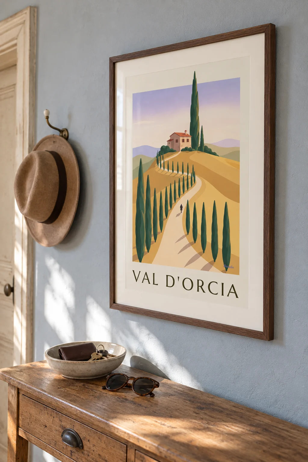
Rolling hills, cypress trees in vertical columns, isolated farmhouses, a pastel orange sky. Vintage Tuscany is rarely chatty: the poster shows a landscape, period. That’s its strength and the reason it pairs with almost anything.
The right interior for a Tuscany poster
Light walls (linen, plaster, rosy beige), old parquet floors, raw wood furniture. Tuscany brings a warmth that heats up rooms that feel a little cold. Not ideal in a room already saturated with bright colors.


Venice, the theater of the canals
Recognizing a successful Venice poster
A bridge, a campanile or a gondola, a turquoise canal, pink and brick facades. Posters that stray from this visual language (pop Venice, expressionist Venice) often look dated and age poorly. Stick with classicism.
How to include it without overdoing it
A single large A1 Venice poster in an entryway or hallway is enough. Venice’s graphic density quickly overloads a room. Above all, no triptych, which turns the living room into the hall of the Doge’s Palace.

In the same spirit

The Amalfi Coast, sun-drenched pop
Lemon yellow, cobalt, whitewash white
Sorrento, Positano, Capri: postwar posters celebrate a pop, cheerful, almost childlike Italy. Close-up lemons, white staircases, cobalt sea. Very effective in a bright kitchen or a sunlit dining room.
Pitfalls to avoid
Don’t multiply Amalfi posters on the same wall: 3 Positanos side by side get tiring fast. A single one, well placed at eye level, is more than enough. Color saturation is the style’s main weapon, so use it with restraint.


3 setups that work
The Tuscan hallway
3 or 4 A3 Tuscany posters lined up along a hallway, spaced 6 cm apart. The passage becomes a stroll, which is exactly the effect the original illustrators were after.
The understated Venetian living room
One A1 Venice poster, in a patinated gold frame, centered above the sofa. No other image within 2 meters. The room breathes, and the drama stays readable.
The Amalfi kitchen
2 A3 posters (a Positano and a yellow lemon) flanking a white shelf or a light backsplash. The pop colors answer the kitchen light, and the result evokes vacation without falling into postcard territory.

Build this wall
3 posters from this article, at true scale


All 3 posters: 100,68 €
Frequently asked questions
You often ask us
Tuscany, Venice or the Amalfi Coast: where to start?
Tuscany if you want warmth (sienna earth, olive green, ochre), Venice if you’re after strong graphics (turquoise, pink and brick, black gondolas on the canal waters), Amalfi if you want colorful pop (lemon yellow, cobalt, whitewash white).
What size for an Italian poster?
One large A1 or A2 poster of Venice focused on a palace or a gondola works better than several small ones. For Tuscany, which loves sweeping landscapes, the 50 x 70 cm landscape size shows off the hills.
Does vintage Italy fit into Scandinavian decor?
Yes, as long as you favor understated posters (Tuscany, Cinque Terre, Lake Como) and avoid overly busy compositions. The light wood of Scandinavian frames pairs well with Tuscan ochre.
Which Italian poster artists should I know?
Marcello Dudovich (1878-1962), Leonetto Cappiello (Italian-French), Adolfo Busi, Mario Puppo. For travel posters signed by the companies (Adriatica, Pirelli), Cassandre also worked for the Italian market.
How do I combine several Italy posters on the same wall?
Choose a common thread: 3 coastal cities (Venice, Naples, Amalfi), 3 wine regions (Tuscany, Piedmont, Veneto), or 3 eras (1920, 1950, 1970). Not a scattered best-of.
Keep exploring


